

Challenge: The WorldRemit transaction flows lived on an outdated application called “Send App.” The company purchased this application early on, but it began to present serious issues with security, user experience and scalability. Although the primary goal was to move off the Send app to a modern and scalable solution, there were several opportunities to improve UX and UI during the process.
Involvement: This is one of the larger projects I’ve worked on during my time at WorldRemit. My focus has been on improving the experience and journeys of the transaction flow and creating an elegant, clean, and easy-to-use interface.
Outside the scalability and security issues presented by the Send app, there were serious user experience issues that we aimed to address during the migration.
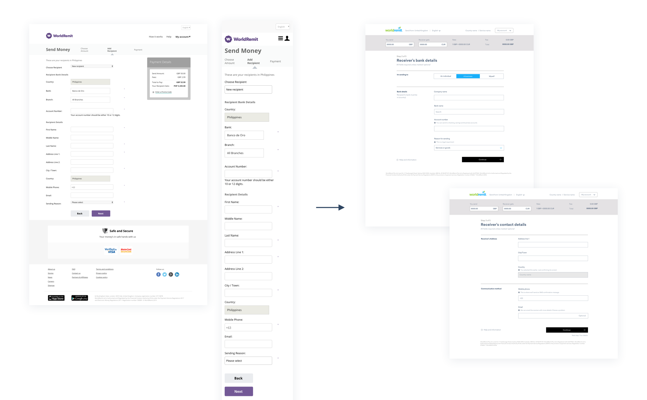
We knew that 44% of users who clicked the “Send” CTA on the landing pages were abandoning once they reached the sign up page. We gathered that this resulted from the amount of form fields, a lack of design consistency and thus, a lack of trust. These problems persisted throughout the transaction flow, on the recipient details and payment pages.
The initial pages were also not optimised for mobile web traffic, which accounted for over 50% of users.
Our goal was to improve the design of the desktop and mobile web pages, while addressing the larger journeys overall and questioning the types of information we request and how we requested it.
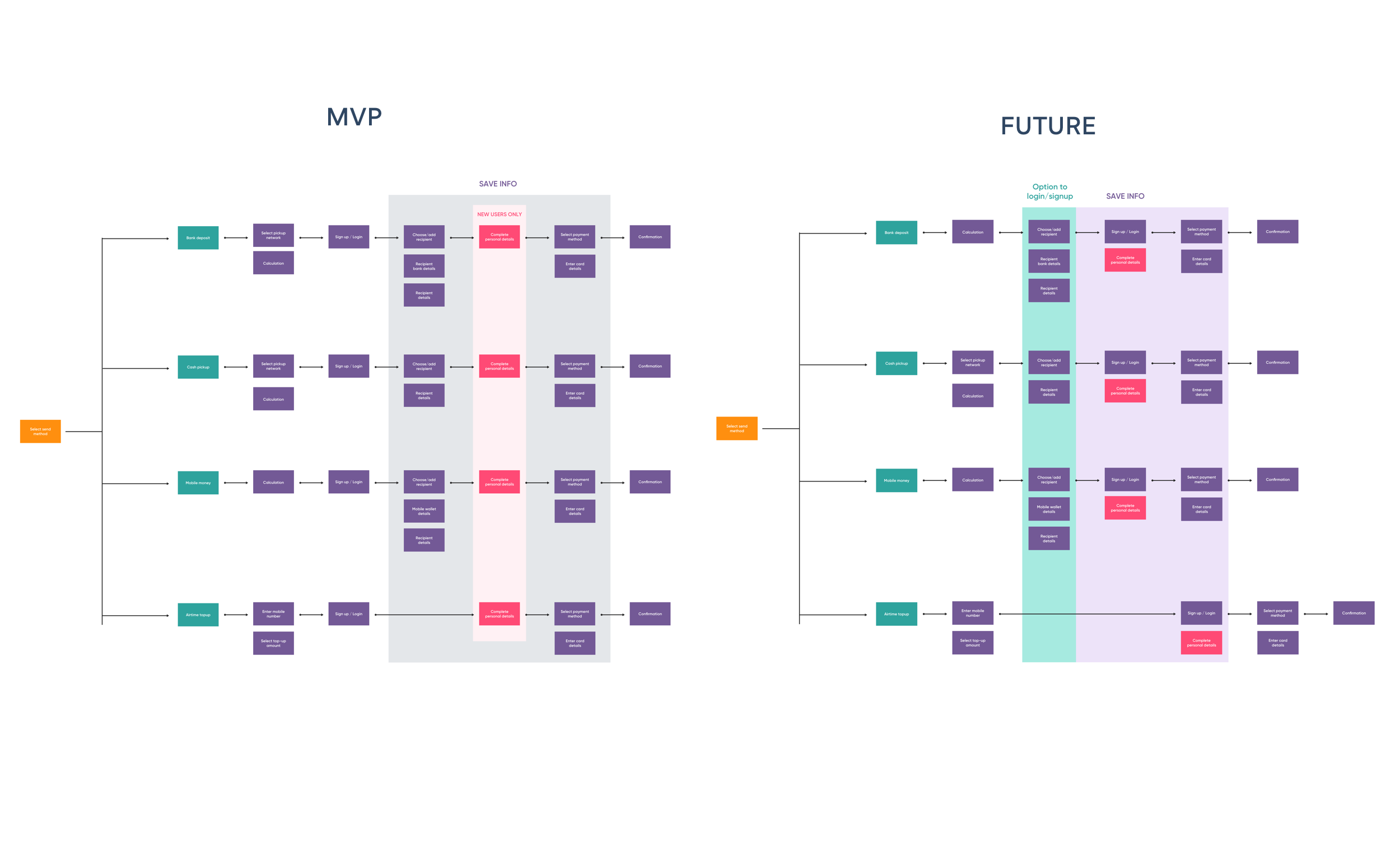
A big challenge of this project was the lack of consistency around one single user flow. Each send method flow (bank deposit, cash pickup, etc) required different user information (which also differed from country to country) and an amended transaction flow. Although most users would stick with one flow, it was important to drive consistency and speed to market for internal stakeholders.
Another challenge was the user data required at different stages, in different countries. Each send country has its own set of regulations and requirements for sending money, which had to be considered throughout the journey mapping and form design.
Finally, we wanted to create something that gave our internal operations team full autonomy to customise form fields based on unique journeys, without having to pull developer resources. This has meant working within configuration services for the Sign Up and Recipient pages. Although this has limited some of the MVP implementations of our work; we are pushing to make changes post-MVP that address the full set of issues with the transaction journey.
Through mapping the user journey, I was able to find consistency among the different send methods, and create logical groups for the users. The three sections I focused on were the Recipient, the Sender and the Payment. Within each of these sections is a breakdown of related forms.
Initially, my plan was to adopt a form with many pages, but simplified steps. For example, I planned to split the recipient details from 1 long form into 2-4 pages, depending on where they were sending. I rejected this idea because I wanted to avoid a seemingly endless series of forms with no end for customers.
Instead, by grouping into three main sections, and keeping the forms focused to one page each, I could provide a seemingly shortened process. I then aimed to use visual design tools (accordion forms, progress bars, etc) to easily show the user their place in the flow and time left to complete.
Outside of optimising the user journeys, I needed to provide a clear, concise and straightforward design that worked well across both web and mobile.
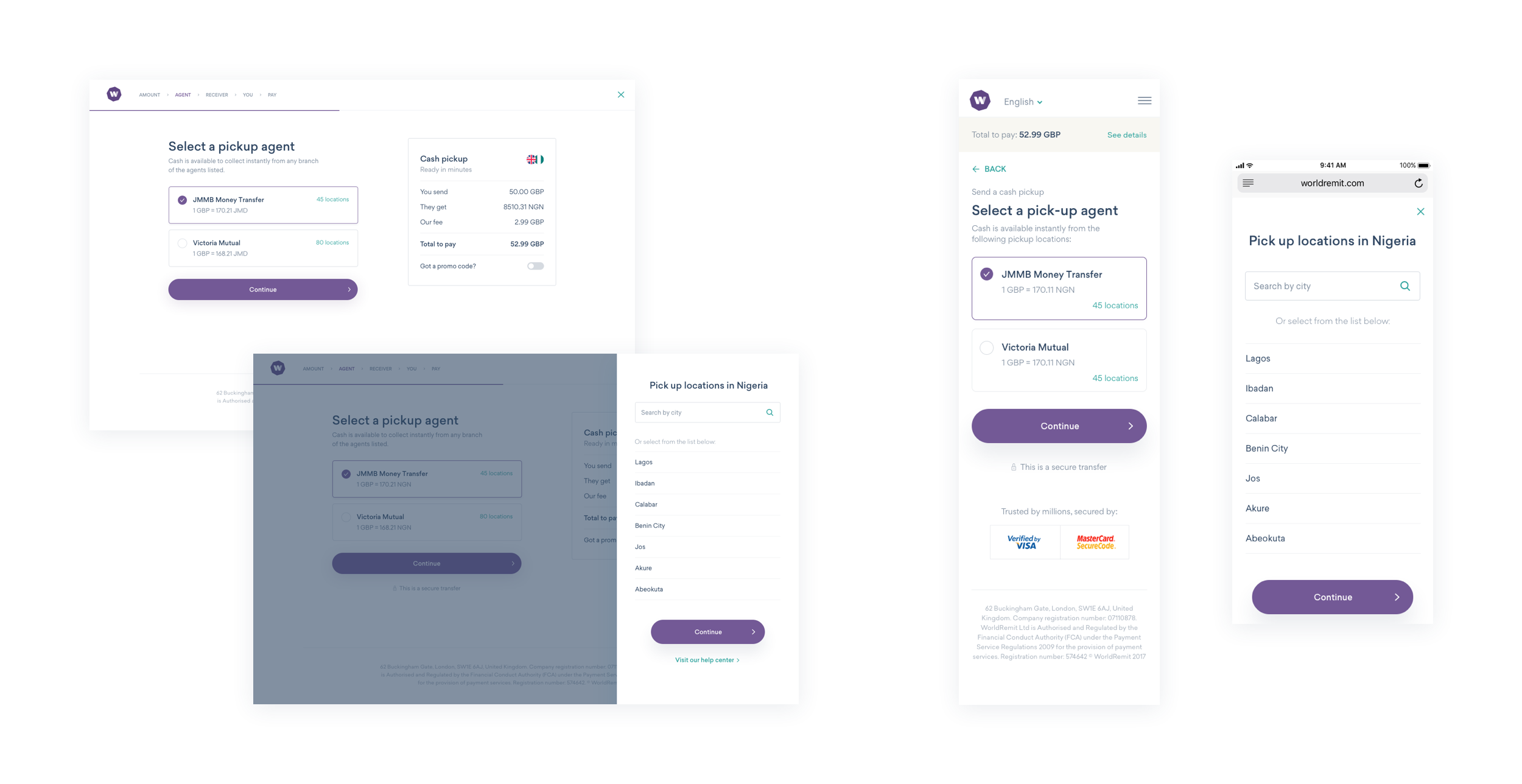
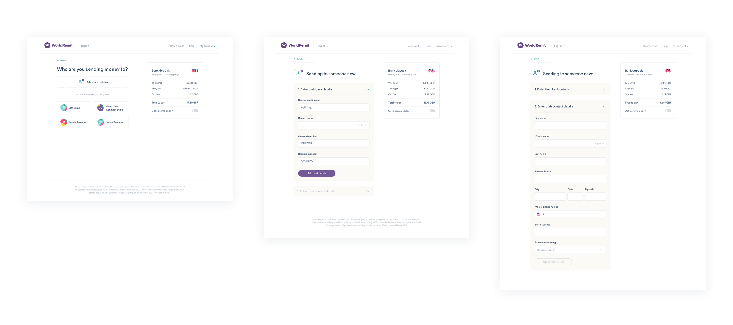
The flow groups that I defined called for effective UI that simplified and condensed large amounts of input fields into a clear form with linear steps. I used the Amazon accordion flow as an example for my initial work. I tested these prototypes with multiple users and they were received well.
Another element of the visual design was ensuring a customer was easily able to access information about their transfer and make edits without exiting the flow. By providing a summary bar (split screen on desktop, banner on mobile), it allowed users to easily view and update their transfer, add a promo-code and get necessary information, all while remaining in the in the flow.
I borrowed the use of modals from the landing pages for the transaction flows, as they allow the user to get information about more complex information, such as cash pickup locations, without having to leave the page.