


Challenge: The existing WorldRemit landing pages were experiencing high bounce rates and low calculator interactions based on page structure and visuals, decision fatigue and calculator confusion. They needed a redesign to improve the customer experience and conversion rate, and allow more control with our internal CMS.
Involvement: This project started in early 2017, and when I joined WorldRemit in November 2017, some user experience and flows had been developed and tested. My role was to build out the existing UX framework, create an elegant visual design for the new pages, and solve new UX/UI problems as they arose during implementation.
The existing landing pages were experiencing a drop off rate of over 40% before users interacted with the calculator, a 60% drop off rate after interacting with the calculator and over 40% after clicking the “Send” button.
Although some of this was outside of our control (i.e. some users not liking the price after interacting with the calculator) there were elements that we could improve to drive a better experience for users and a higher conversion rate.
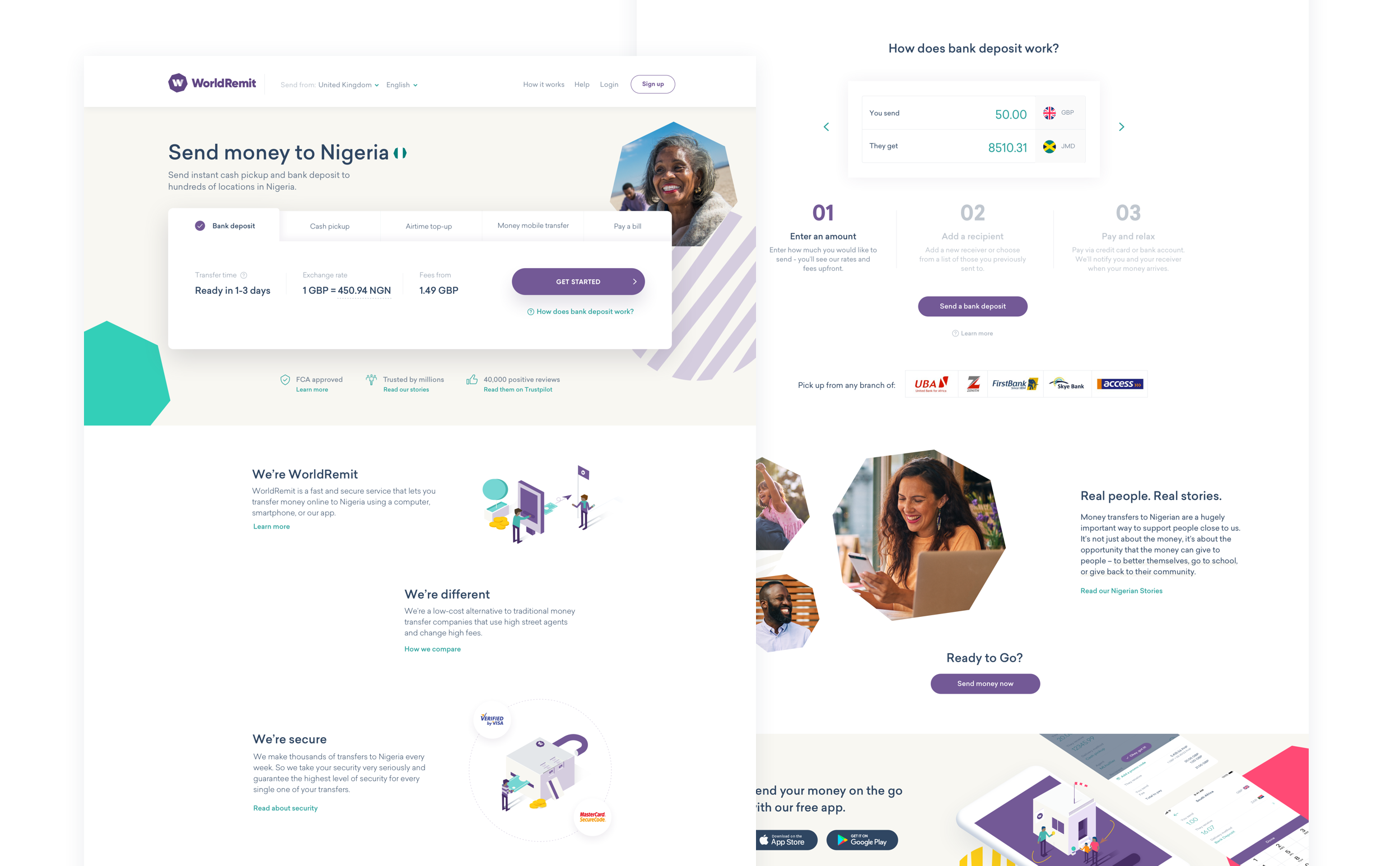
A big challenge of this project was where to place the calculator in the flow. On current pages, users interacted with it directly without advancing to the next page. However, in testing we found that users felt fatigued based on how many steps it took to see a calculation.
Unlike our competitors, we provide various different methods to send money, sometimes up to 6. Providing users with that many steps and decisions to get to a basic calculation was not intuitive.
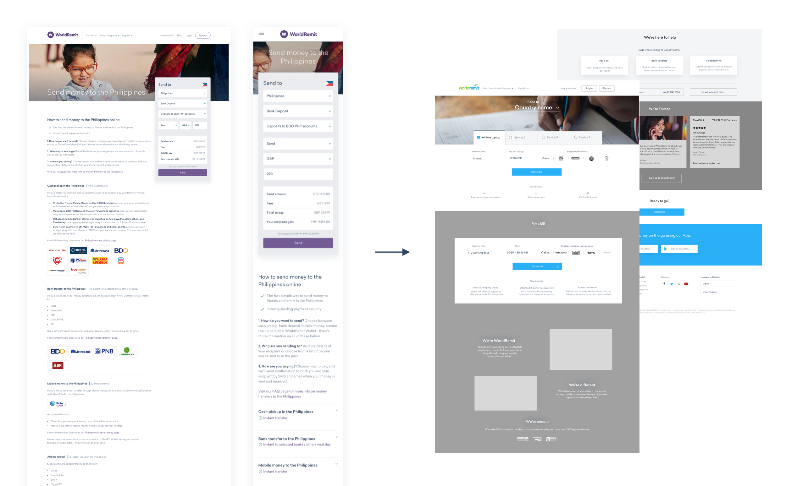
Another challenge we faced was the variety and number of landing pages that needed to be created. We serve over 140 countries in 6 languages, so creating a modular system with designs that could be reworked easily, and without developer resources, was imperative.
After multiple user testing sessions, we decided to move the calculator to the next page in the flow. This allowed users to decrease the amount of decisions they had to make on the page to a maximum of one (the send method). We also created a clean, simple view of important pieces of data, including exchange rate, our fees, partners they could use, promos, and more.
To better present the vast amount of information for each page, we decided to use modals that were accessible via above-the-fold links. This would allow users to deep dive when needed, without having to scroll or visit another page.
Finally, we implemented these pages with a focus on a modular system that could be completely customised without developer resources. This was to allow different departments to run valuable experiments and create unique pages, all while staying within the style, interaction and mission of the page.